TL;DR
Creating a data-led audience audit procedure using LinkedIn ad data to prove product value without a full setup. By introducing a new metric, Engaged%, and impactful data visualisations, we converted 9 out of 27 prospects, generating £1.6M in annual recurring revenue (ARR) with three simple but effective data visualisations.
Who should read this?
B2B tech founders, commercial leads, and marketers looking for smarter ways to demonstrate product value and boost conversions without full product trials.
.jpg)
Proving Business Value
Most businesses try to squeeze the promise of their product into a single hour-long meeting, doing their best to explain its merits in hopes of converting prospects into profit. For small businesses, where a software trial period isn't feasible or the infrastructure isn't mature enough for a quick full setup, these meetings can be a real challenge. While many small businesses (sometimes desperately) accept the low conversion rates at this stage and turn it into a numbers game by reaching as many prospects as possible, at Adzact, we adopted a different strategy: building the most impactful data visualisations we could, to showcase the functionality of our platform in the clearest way possible and prove our business value—an approach we later named the Audience Audit.
Adzact's core product, an ad platform built for B2B marketers that reveals the true addressable market of its clients, identifies the best businesses for clients to target with their services or products. Typically, this process takes five weeks and involves multiple machine learning engineers before results are visible and we can demonstrate the expected performance boost in B2B marketing efforts. To address this, we conceptualised and built the necessary analyses and visualisations using B2B marketing activity data. Extracting this data was automated via the Ad Analytics API from the LinkedIn Marketing Developer Platform—the only aspect for which the Commercial Team required support from Software Engineering.
Ideation
We started by experimenting with our existing clients, since we already had access to their marketing data. The main idea was to divide each LinkedIn Campaign Manager audience into two groups: Target Audience and Others. We wanted to illustrate that within a large audience, there is a smaller, high-priority Target Audience group where marketing efforts should be focused—ideally ignoring the rest.
This also marked the beginning of our integration phase, where prospects could use LinkedIn SSO to grant consent, allowing us to pull their LinkedIn Campaign Manager activity data directly into our servers.
Data Extraction
After securing the data, our process focused on extracting the necessary metrics and dimensions for accurately reporting the B2B digital marketing campaign performance of each business in the prospect's LinkedIn audience.
Data Processing
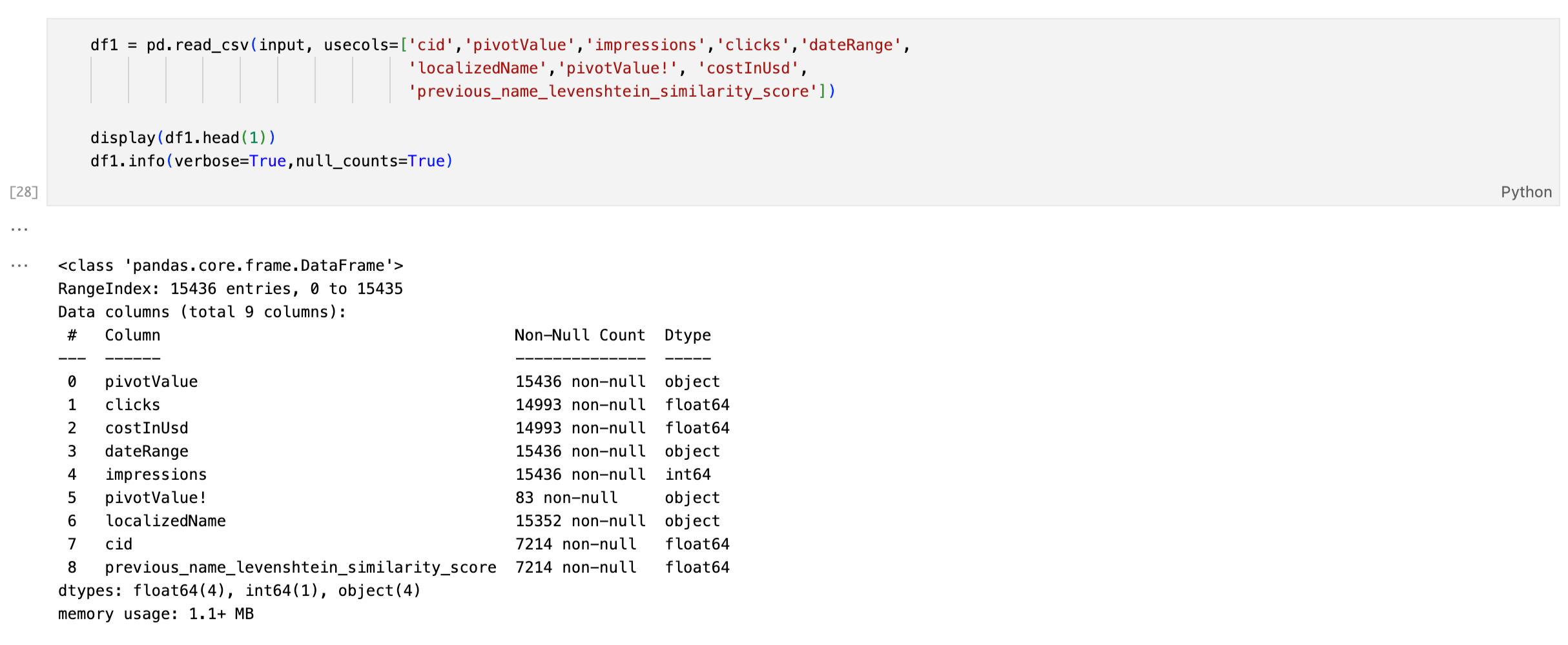
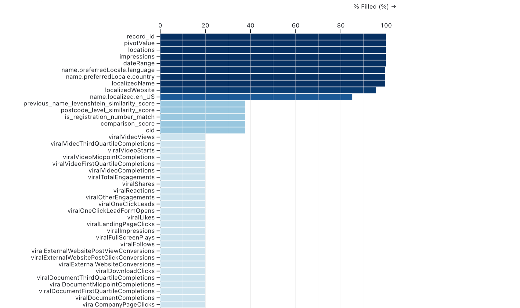
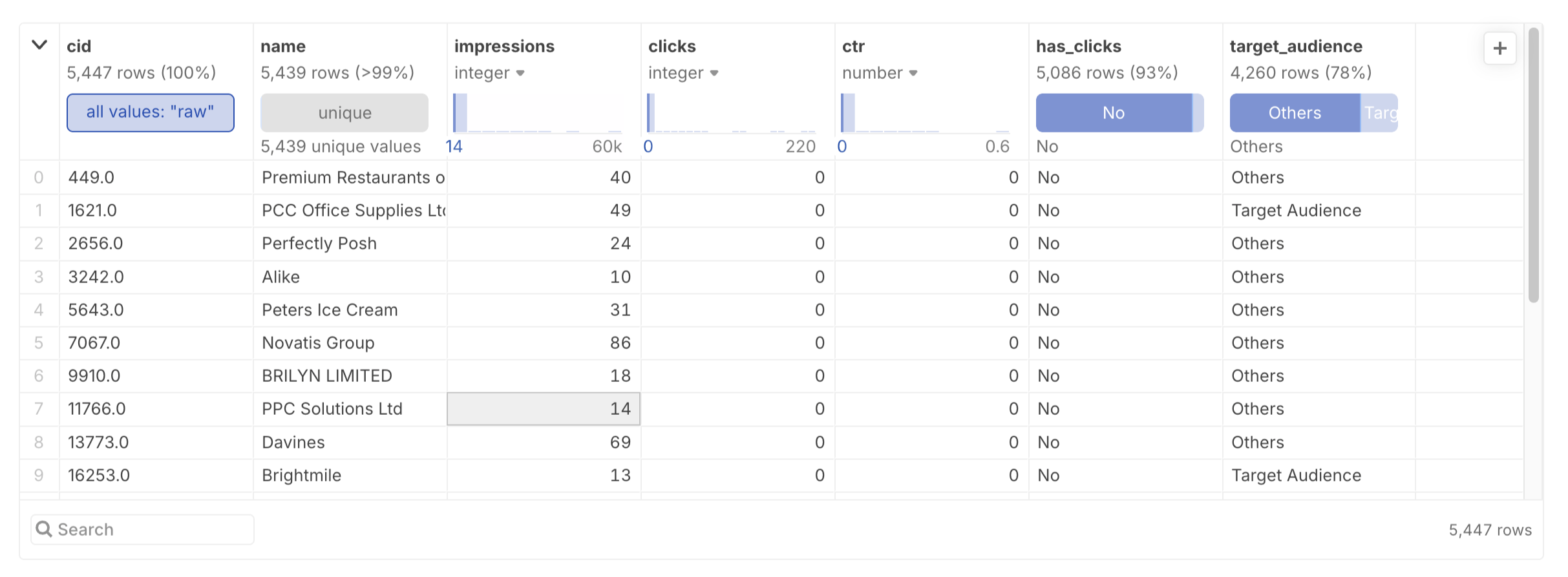
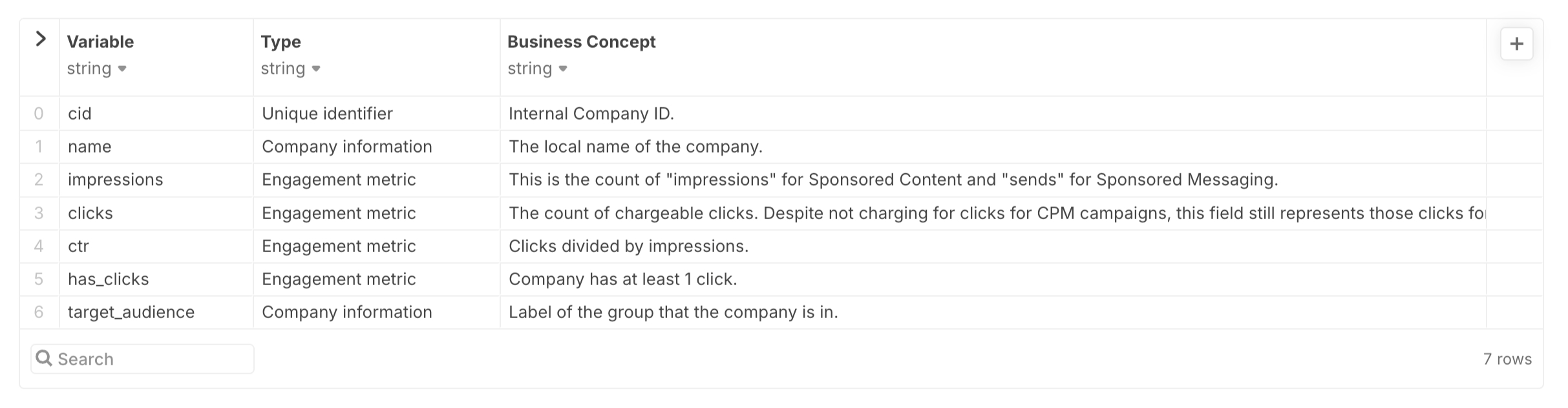
From a sizeable file (with 109 available columns), we collected key fields such as clicks and impressions (to calculate click-through rate, CTR%), cost (to gauge the marketing budget impact), and localised names (to provide clear examples from both Target Audience and Others).
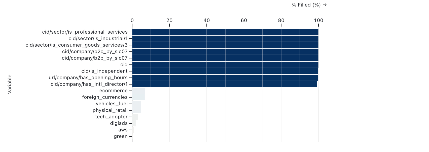
At this stage, we matched each company in the audience to our proprietary database of UK businesses, using names, addresses, and other metadata through an advanced matching algorithm developed by our Data Science team. This allowed us to accurately use our feature set and identify the Target Audience with the optimal CTR%.
Initial Checks
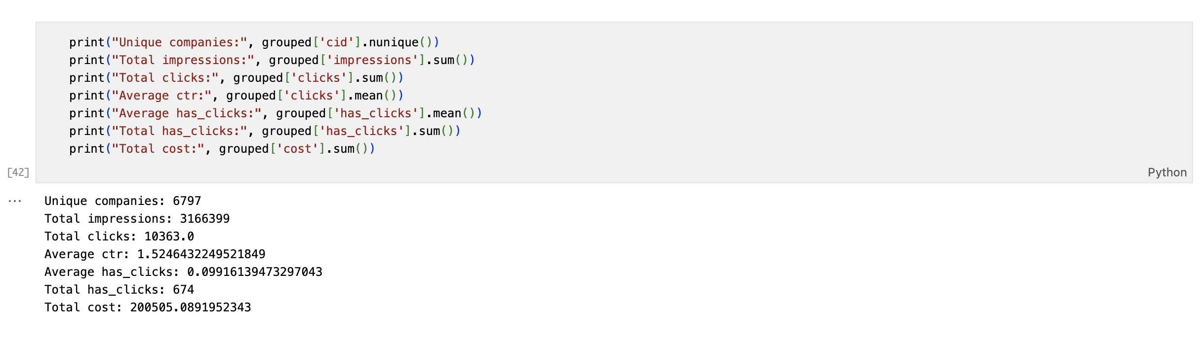
As a high-level sense check, we used basic statistics from all businesses in the audience with a confident match in the UK economy.
While CTR% is often seen as the key indicator, we developed a new metric for B2B marketing: Engaged%.
Engaged% is the ratio of unique companies with at least one ad click (has_clicks) to all unique companies in the audience. This proved to be a more informative KPI than CTR, which is often misinterpreted in B2B marketing contexts, as Engaged% more directly measures company-level engagement rather than the actions of individuals within those companies.
The key insight here is that your customer is a single company, not the individuals within it. Therefore, the number of impressions or clicks from all the employees of a company is less meaningful.
Feature Selection
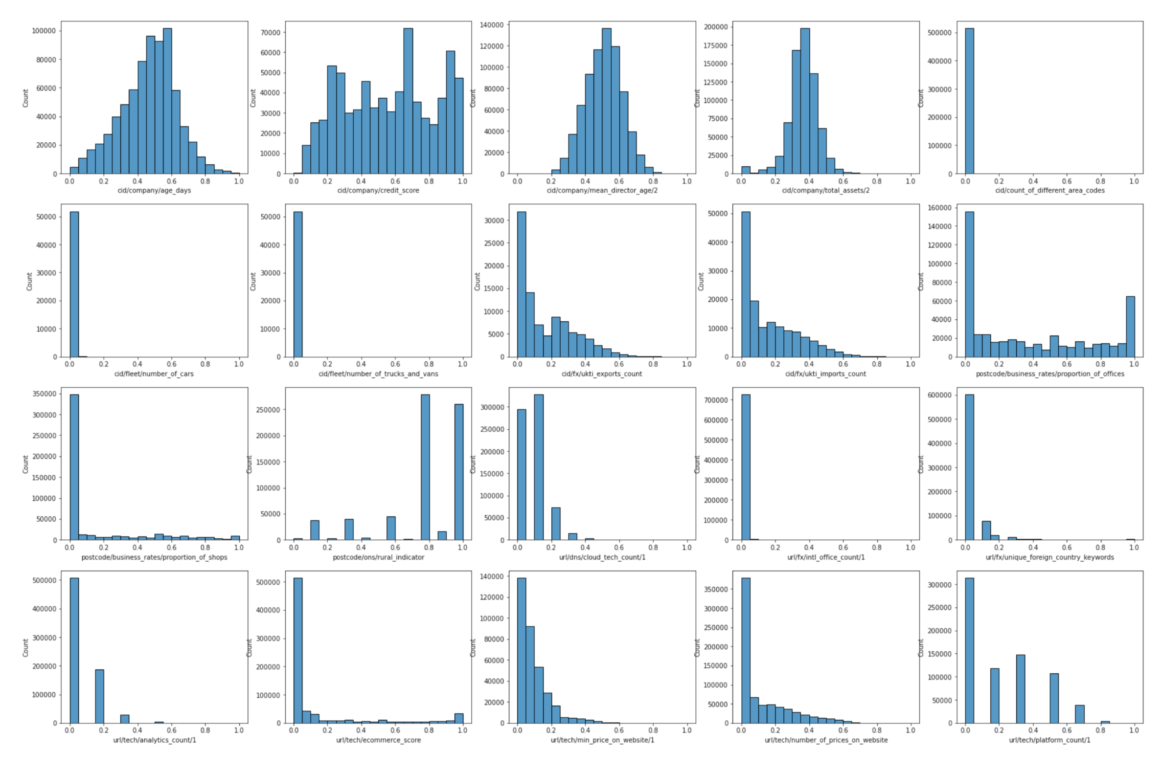
After deciding on Engaged% as our main KPI, the next step was to review the distribution of features within the Engaged% metric to identify the best separators—those resulting in the highest variance in Engaged%.
Each feature split the audience into two groups with differing Engaged% rates; the greater the difference, the better the feature acted as a separator.
At this point, we manually reviewed the features to ensure they made sense, given the industry and business type of the prospect, and chose the best 4–5 separators.
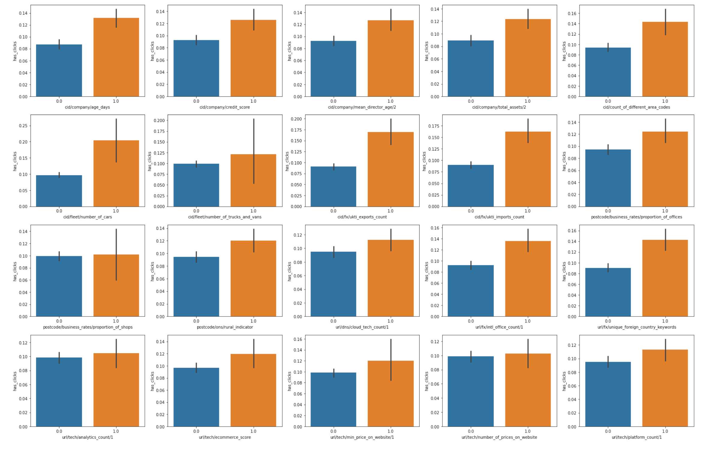
With the best features selected, we built a model around them to define the Target Audience: each company in this group would possess at least one of the attributes from the selected separators. The gap in Engaged% between Target Audience and Others depended on the effectiveness of each feature.
Automation
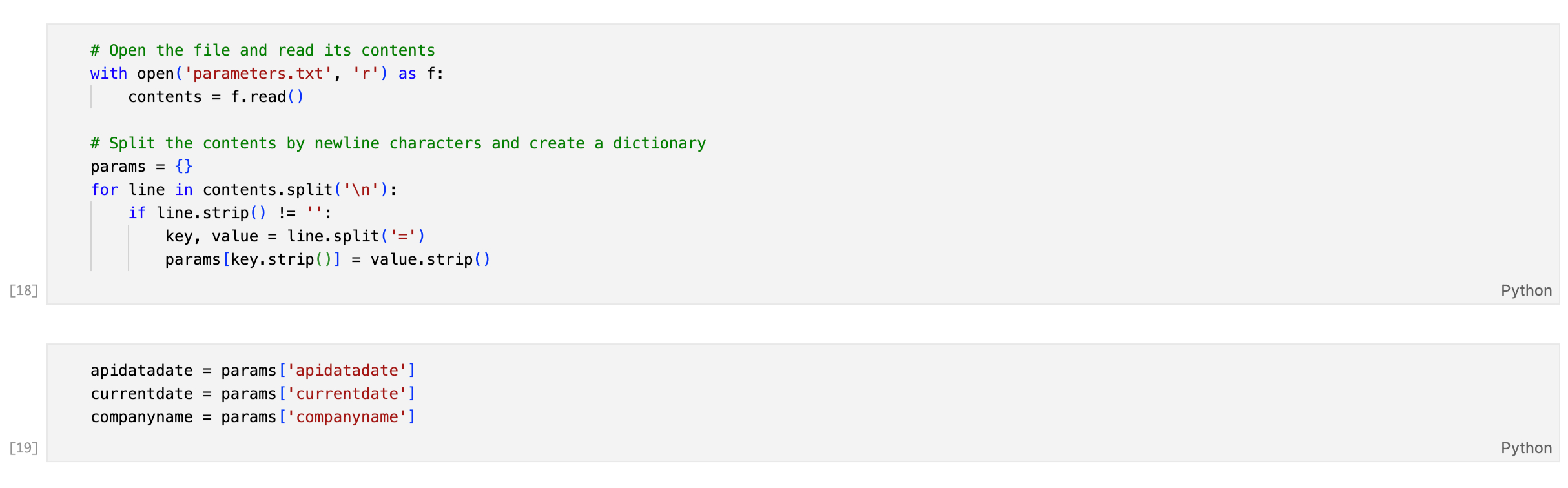
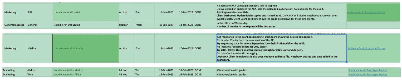
While we often refer to the process as "automated," the level of automation changed over the course of the project. Initially, automation meant saving a parquet file to our blob servers after the prospect's LinkedIn SSO consent. Later, the workflow evolved so that data was saved into the company database and loaded into an analysis notebook, where only a parameters.txt file needed to be updated—a semi-automated data processing workflow, with manual sense checks still necessary at intervals.
Visualising Data
Once the optimal feature group was applied, the established groups were ready for visualisation. The key task here was to demonstrate the difference between the Target Audience and Others in both group size and engagement metrics.
We started with the question: Can you improve the performance of digital ads by identifying the 'good fit' companies in your existing LinkedIn Campaign Manager audience, and separating them from the rest?
To answer this, we designed three simple yet highly effective data visualisations, each building on the previous and carefully managing cognitive load for the viewer, step by step.
Audience Split: Target Audience & Others
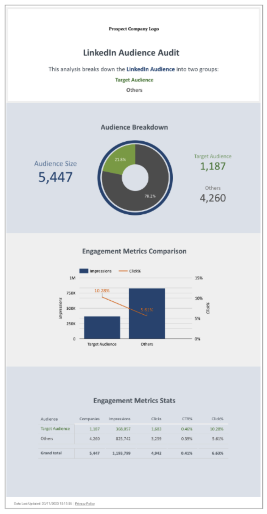
This chart displays the distribution of your LinkedIn audience into Target Audience and Others groups.
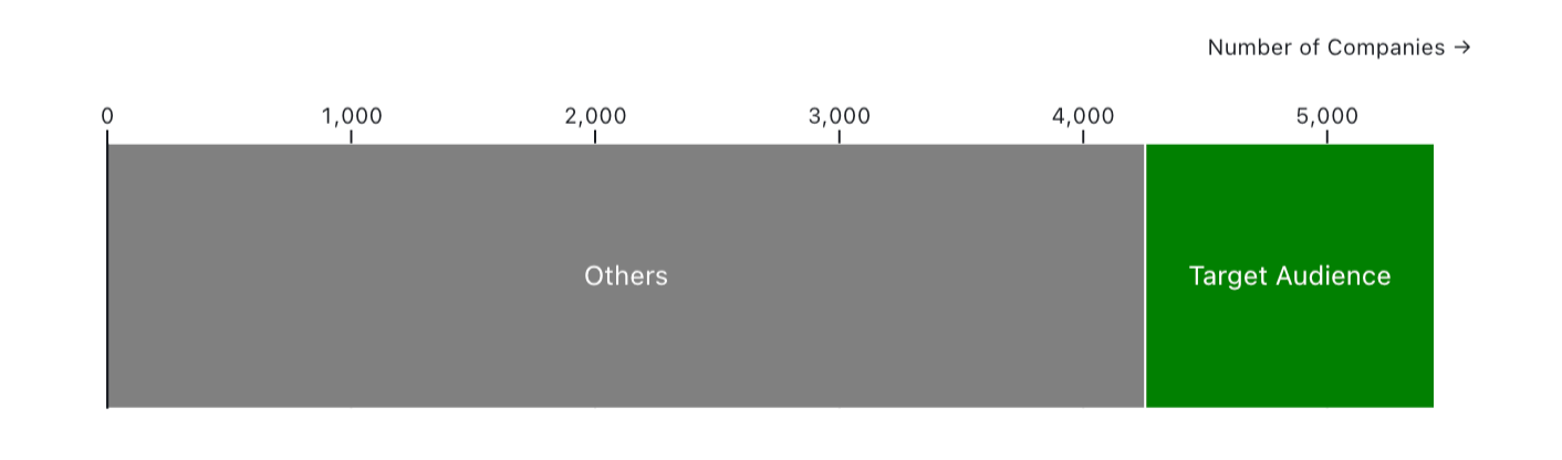
Using Adzact's features and the engagement metrics of the LinkedIn campaigns, 5,441 companies in the audience is divided into two groups: Target Audience (22%) and Others (78%).
The Target Audience group, which is much smaller in size compared to Others, is anticipated to perform better with respect to the engagement metrics: CTR% and the Engaged%.
Design Notes
A horizontal stacked bar chart in conjunction with length and area magnitude channels was selected to depict the audience size and the distribution of the groups therein. As the identity channel, colour hue was selected to distinguish the groups.
A more subdued grey hue was utilised to represent Others, whereas green was employed to denote the Target Audience, serving to draw heightened attention.
While this visualization provides the user with an insight into the audience size, it concurrently suggests that there will be a differentiation between the engagement metrics of the respective groups.
Proportion of Engaged Companies
This chart displays proportion of the engaged companies and non-engaged companies in the groups: Target Audience and Others.
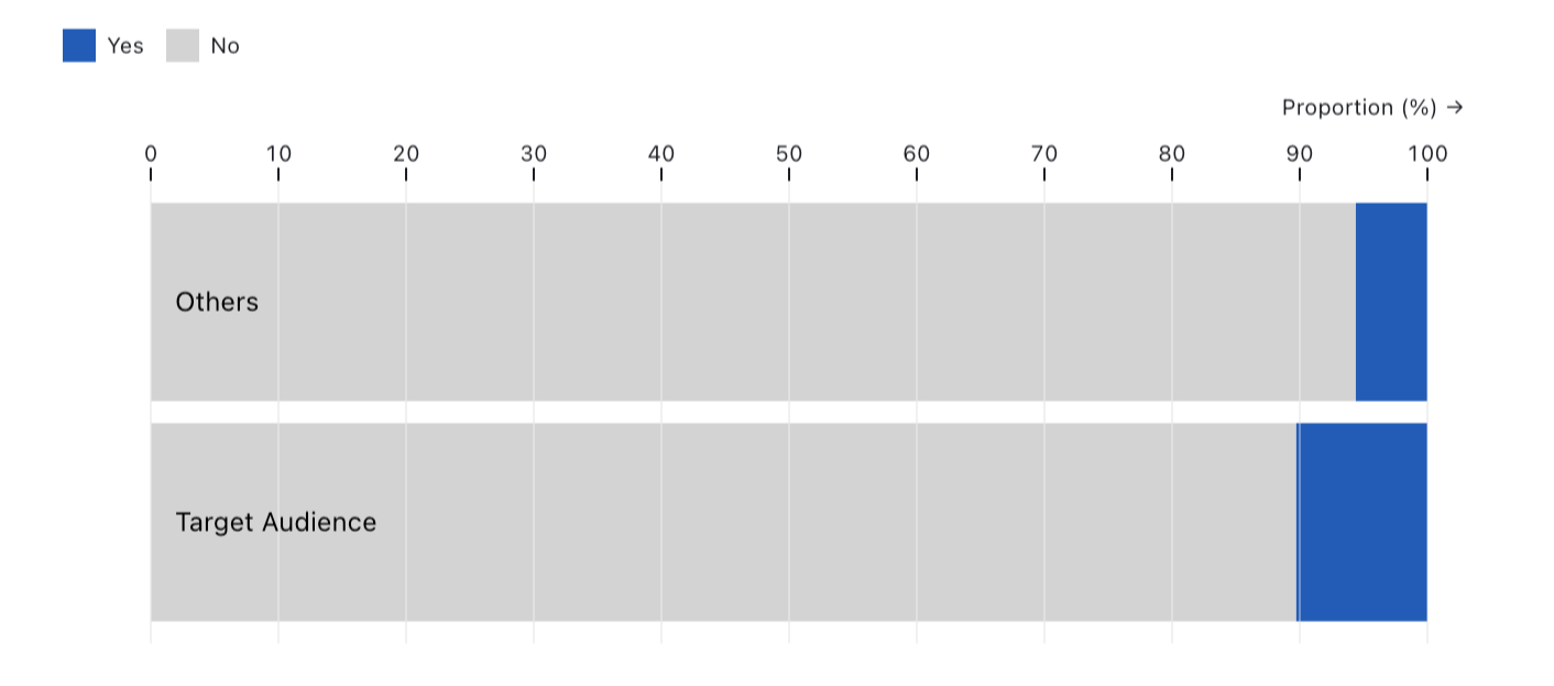
Within each group, there exist companies that have engaged with your ads, evidenced by clicks, and those that have not.
It is evident that the proportion of engaged companies within the Target Audience (10.3%), doubles that of those in the Others (5.6%).
Design Notes
Any company that has at least 1 click was assumed as an engaged company.
Vertical spatial position channel was employed in a horizontal 100% stacked bar chart to separate groups while color hue channel was utilised to depict Engaged and Non-Engaged categories. To represent the proportions of these categories, length and area magnitude channels were chosen.
This visualization introduces the initial engagement metric, the proportion of engaged companies, and subsequently sets the stage for the final engagement metric, the Click-through Rate, which was alluded to in the first section.
Engagement Metrics Comparison
This chart displays the comparison for engagement metrics Target Audience and Others groups.
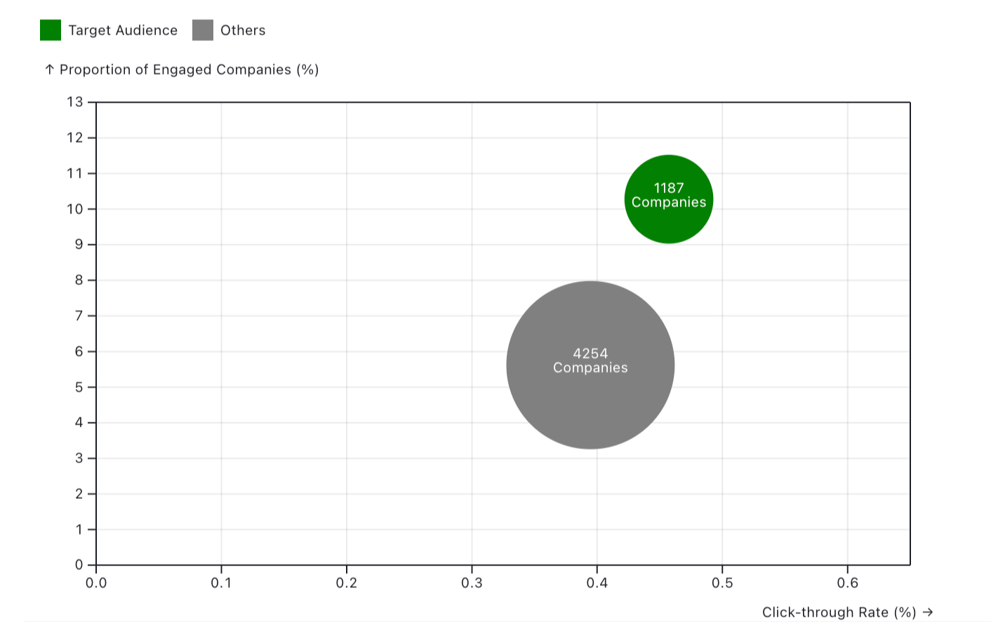
The Target Audience group not only has a higher proportion of engaged companies (y-axis), but also performs better in terms of click-through rate (x-axis).
Design Notes
A scatter plot was used to leverage its two quantitative attributes: vertical and horizontal spatial position, representing Proportion of Engaged Companies (%) and Click-through Rate (%) respectively. The third quantitative attribute, the number of companies in each group, was encoded by the size channel to the point marks. The usage of colour hue channel was sustained from the first section.
This visualisation combines the insights derived from the first and second sections and furnishes the concluding insight through a comparative analysis of the Target Audience and Others groups in terms of Click-through Rate.
Evolution of the Presentation Display
While these visualisations represent the final version of the Audience Audit, the evolution of their presentation demonstrates how crucial iterative workflows are in visual analytics when the very first version of the Audience Audit is considered.
Among many iterations, one output version allowed viewers to select/deselect features interactively in Looker Studio, observing the impact on CTR% and Engaged%—effectively providing prospects with a playground to experiment with different audience sizes and engagement metrics, showcasing Adzact's platform capabilities even more prominently.
If you are a B2B marketer and want to explore the capabilities of this interactive version of the audience audit, you can still reach out to Adzact on their free trial page and opt in for a demo.
Generating £1.6M ARR with Only Three Data Visualisations
The Audience Audit was conducted and presented to 27 unique prospects over four months, nine of whom became clients in the same financial year. This resulted in generating £1.6M ARR in subsequent years (generating ARR with data visualisations is not usually the main function of analytics departments), underscoring the power of data storytelling—even when using the simplest data visualisation types, like bar charts and scatter plots.