TL;DR
The literate visualisation framework was developed to improve data communication and decision-making processes in the business domain. An analysis scenario template, a set of Observable notebooks stemming from this framework, is provided for any analyst wanting to use a systematic approach in their analytics projects.
Who should read this?
Data visualisation specialists, data analysts, business intelligence analysts and anyone who wants to communicate their findings from data.
Journal of the Data Visualisation Society, Nightingale. Nightingale
Greetings
My first ever article, and the longest-standing item on my to-do list. I thought this would be a very suitable topic for the first article on this website, where I try to combine my know-how and experiences to produce something useful for anyone interested in data analytics and visualisation.
I had been a data analyst before completing my Master of Science at City St George's, University of London in 2023. I chose the Data Science MSc mainly to grasp all aspects of data and its applications from a machine learning perspective, just before generative AI takes over the world.
Although I wanted to learn the essentials of and the theory behind cutting-edge techniques in machine learning and artificial intelligence, there was (and still is) something at the back of my mind: I want to visualise data, and design beautiful visualisations from which anyone can extract the insights they're interested in. This interest (or maybe I should call it a passion) led me to undertake my dissertation project at City St George's, University of London in the field of data visualisation, rather than choosing a machine learning-related topic, like many of my peers did, such as reinforcement learning, image recognition, or natural language processing.
As a result, upon completion of my dissertation project, I had developed a data visualisation framework that I (or any other data analyst, business intelligence analyst, or even data scientist) can use in their daily job to inform and structure their requirement gathering, data modelling, and visualisation/dashboard building process. If you think you're one of these personas, continue reading.
The Problem
"The most precious resource we all have is time". — Steve Jobs
To state the obvious in any business context, time and prioritisation are your biggest limiters, and I've always felt this in all my jobs and freelance projects: getting caught up with limited timelines, rushed requirement gathering, and design processes for necessary reports, dashboards, or even ad hoc analyses. Until I started my masters, my way of working and task completion methods often lacked a unified and consistent approach, and I knew my dissertation project was going to give me the necessary time, motivation, resources, and supervision to finally get things into order.
The Solution
Literate Visualisation Framework — A scientific way of structuring your data visualisation deliverable
My dissertation project (as aimed) resulted in a data visualisation framework in the form of a set of guidelines for analysts to follow when starting a new analysis task or visualisation project. It is inherently flexible for anyone who desires to add or remove items for their convenience.
The five main sections of the framework along with their objectives are:
- Knowledge - Establish an understanding of existing knowledge of users in the audience.
- Data - Clarify the data used and the transformation steps applied.
- Structure - Establish a structure for the final deliverable.
- Conviction - Utilise good design principles.
- Design - Ensure the best practices of data visualisation are employed.
For anyone interested in the details of the study itself, the project report with the appendices is available here. The framework itself is located in Appendix G. The reason why it's called the "literate visualisation framework" is that it's rooted in literate visualisation, which was developed by Jo Wood at City St George's, University of London in 2019.
A Scientific Way to Design Your Dashboards
There must be something more than just pages of text… While the framework itself is in the form of a guideline, one of the main objectives of the project was to turn this framework into a more practical form that any analyst can integrate into their workflow. The product of this objective is the template that can be used in any analysis scenario. It was developed to support you design your dashboards, scientifically. I've built these templates in a beautiful data visualisation medium called Observable because of its flexibility around using markdown, HTML, and JavaScript in their notebook cells. As the template only includes markdown, transferring this template is as easy as copying and pasting the text to your desired analysis / notebook environment.
You can access the template here: Prototype Analysis Template v1
A brief set of instructions on how to use this template would be:
- Start with the Introduction: Initialise your analysis and the requirements. Choose the relevant information for your analysis to officialise it. Proceed with answering the questions in Knowledge. Completing this section will give you a very good idea of what is required by whom; why you're doing what you're doing.
- Continue to Data: Understand and document your data. Specify your data sources and field mappings. Make an assessment of the raw data, before any transformation. Document your data transformation. Completing this section will give you a better understanding of your data, potentially resulting in covering all aspects, even ones you may not be aware of.
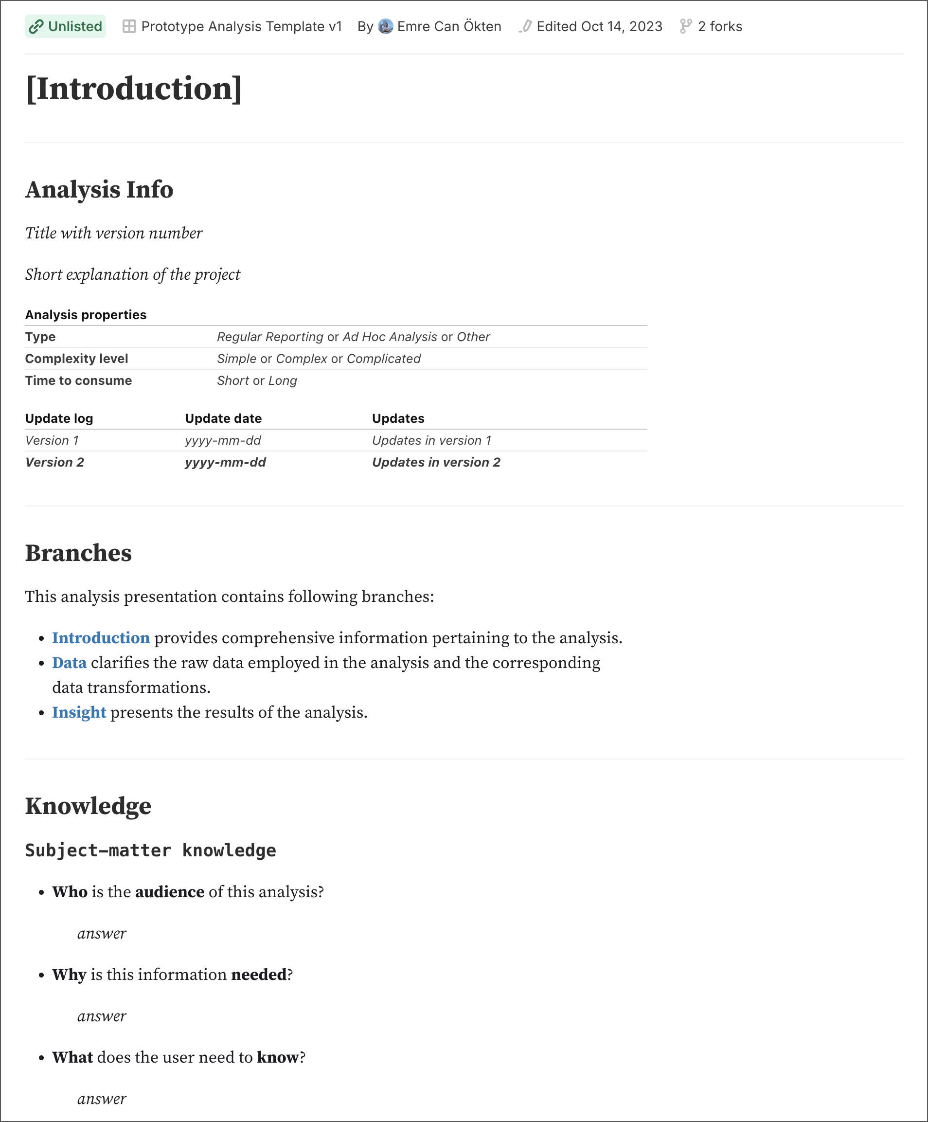
Prototype Analysis Template, Introduction
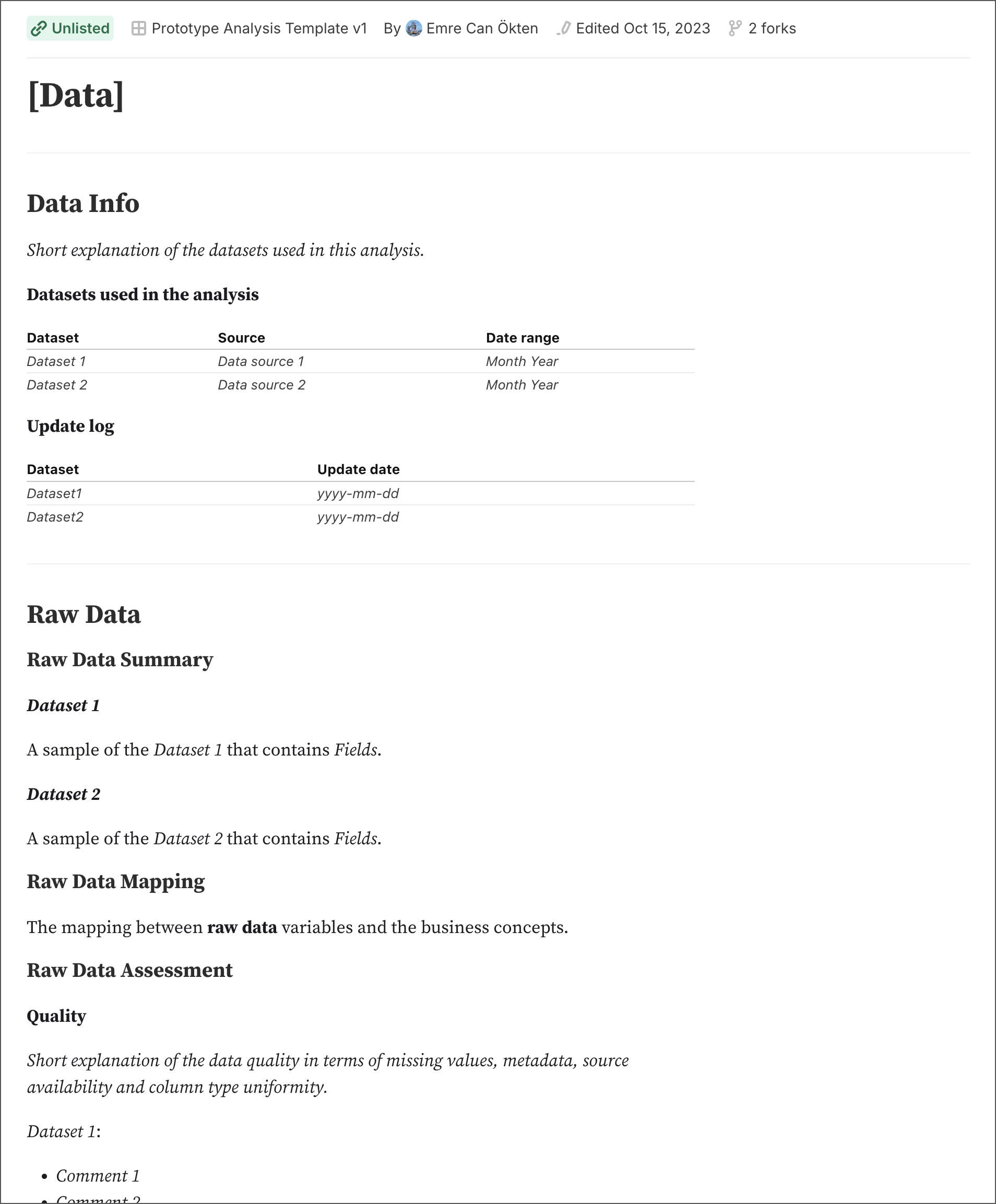
Prototype Analysis Template, Data
- Finish with Insight: Present your findings to your audience. Choose the analysis structure you want your audience to experience. Design your visualisations by following a set of questions before and after your design process. Completing this section will give you your final output, hopefully with a narrative led and created by the design questions in the template.
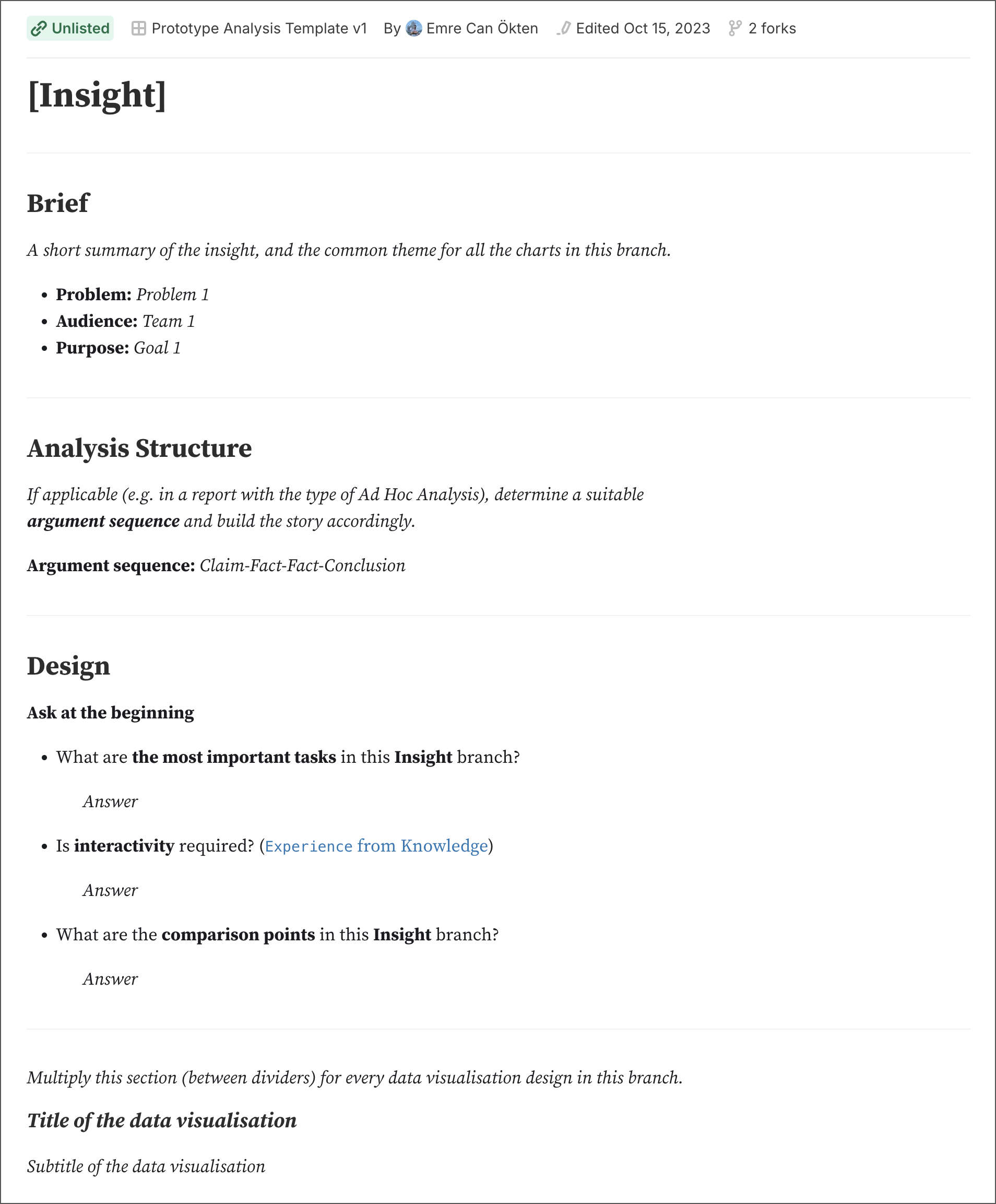
Prototype Analysis Template, Insight
Although I've tried my best to make this template as flexible as possible, please feel free to copy, add, remove, and modify it in any way you think works better for your objective. If you have any thoughts or feedback regarding this framework (or the template), please feel free to say hi via email or LinkedIn. If you've made it this far, I offer my sincerest thanks and hope you found this topic both enjoyable and useful.