TL;DR
Candlestick charts show what traders felt during a session, not only where the price went. On their own they are not enough. I found they work best when I read them alongside indicators such as Bollinger Bands, ADX and RSI. After reading Steve Nison's book, I see price charts as a visual record of fear, hope and hesitation.
Who should read this?
Beginners who have never opened a trading chart, data visualisation fans who like seeing human behaviour turned into a chart, readers who want to know how technical analysis works.
Not having enough money is usually a problem, while having enough money to think about how to make it work for you is another. The latter is probably harder one to handle, because you have options.
I started an interest in investing a few years ago, after reading Psychology of Money by Morgan Housel. It was a great introduction to build a perspective against money and savings, however it was still a very much surface level and conceptual knowledge and provided a great mindset on how to approach money in life and how to make it work for you in the longer time horizons. It wasn't enough for taking actions, which required further research and understanding of macroeconomics and the current state of the world.
Until recently very recently, I've been only saving some money every month and investing in some stocks, commodities and cryptocurrencies. Then I got offered a brief (unofficial) introduction course to investing by a generous friend. One of the books he suggested was Japanese Candlestick Charting Techniques.
The Book Behind This Article
Japanese Candlestick Charting Techniques is written by Steve Nison, and I read the second edition on my Kindle. As usual, I highlighted as I went and moved the highlights to Notion afterwards. This article is built from those notes.
The book's main claim is that candlestick charts are a tool and not a system. I kept coming back to that idea while writing.
Technical vs Fundamental Analysis
Fundamental analysis asks what an asset is worth. You look at earnings, price-to-earnings ratios, economic statistics and the health of a business. Technical analysis ignores most of that and studies price and volume, because price is where every buyer and seller's opinion ends up.
Nison makes a point here that stayed with me. Fundamental analysis gives a gauge of supply and demand, but it has no psychological component. Technical analysis is, in his words, the only mechanism that measures the emotional side of a market. He quotes a line I liked: there is nothing so disastrous as a rational investment policy in an irrational world.
I connected this to Harari's idea that money works because everyone believes others will accept it. Markets run on shared belief in the same way. If enough people react to a chart level, that level starts to matter, whether or not the fundamentals agree.
What Candlestick Charts Are
The history is short. Candlesticks come from Japanese rice trading in Osaka, where rice coupons sold against future deliveries became what Nison calls the world's first futures contracts. The trading principles developed there evolved into the candlestick method still used in Japan today.
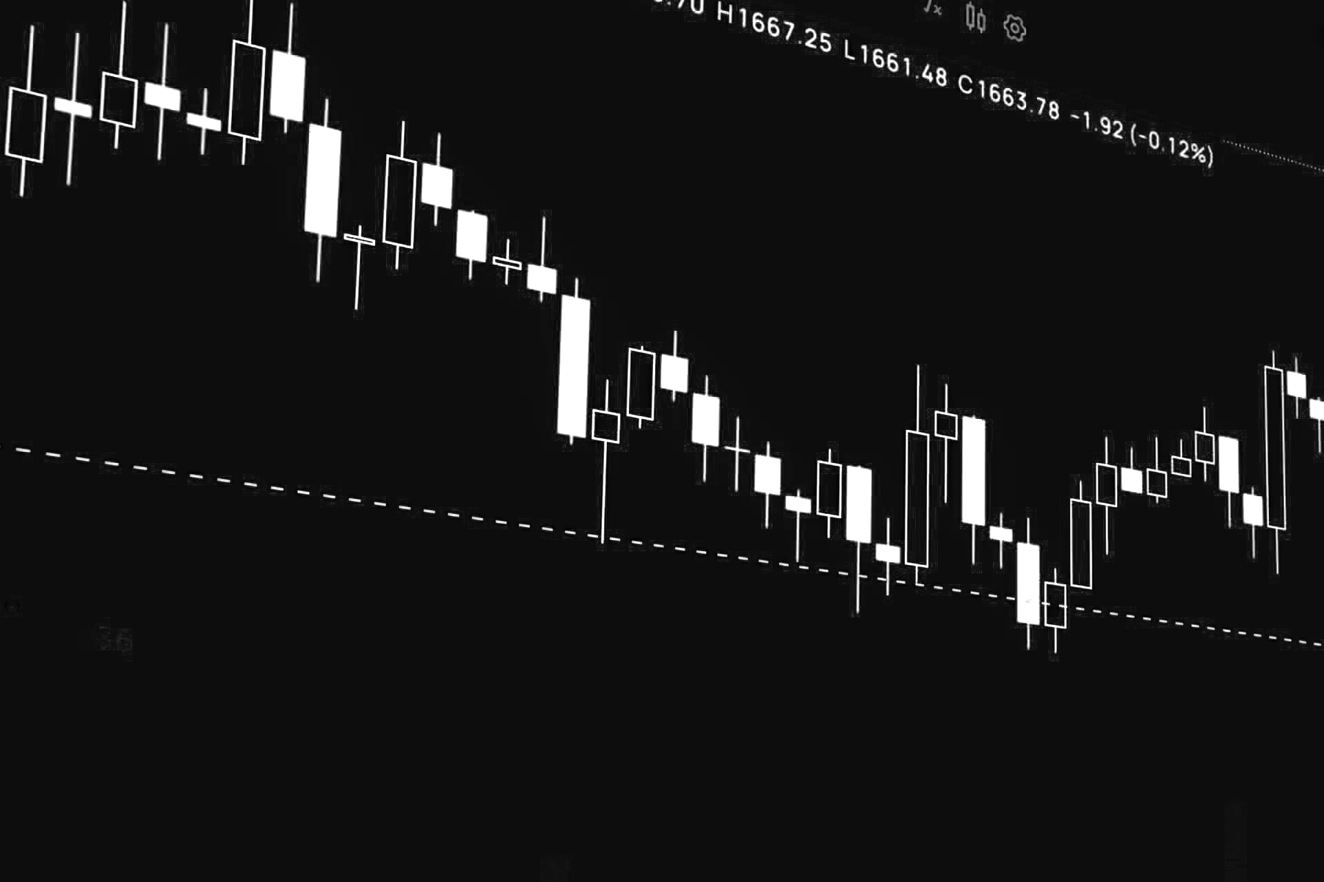
Each candle summarises one session. The rectangle is the real body, which spans the open and close. The thin lines above and below are the shadows, which show the high and low. A tall body means a one-sided session, and a small body means neither side won.
This is why I think candlesticks are a distinctive way to visualise data. A line chart shows one number per session. A candle shows four, and it shows how they relate to each other. The Japanese pay particular attention to the open and the close because those are the two most emotionally charged points of the day.
Three Candlestick Patterns and the Psychology Behind Them
Doji
A doji is a session where the open and close are the same, or very close. The market moved around and ended where it started. The psychology is indecision. After a long rally, a doji suggests the buyers are tired and the sellers are testing their strength.
Nison adds a caveat from experience: doji are better at calling tops than bottoms. A doji in a falling market needs more confirmation. A doji does not mean an immediate reversal either; it means the market is vulnerable.
Hammer
A hammer has a small body at the top and a long lower shadow, at least twice the height of the body. It appears after a decline. During the session sellers pushed the price down hard, then buyers pulled it back up. The long shadow is a visual record of rejected lower prices. In the book's words, the market is hammering out a base.
Hanging Man
The hanging man looks exactly like the hammer. The only difference is where it appears: after a rally. Same shape, opposite meaning. The shadow now shows that sellers have found their voice at the highs, and buyers are no longer in full control.
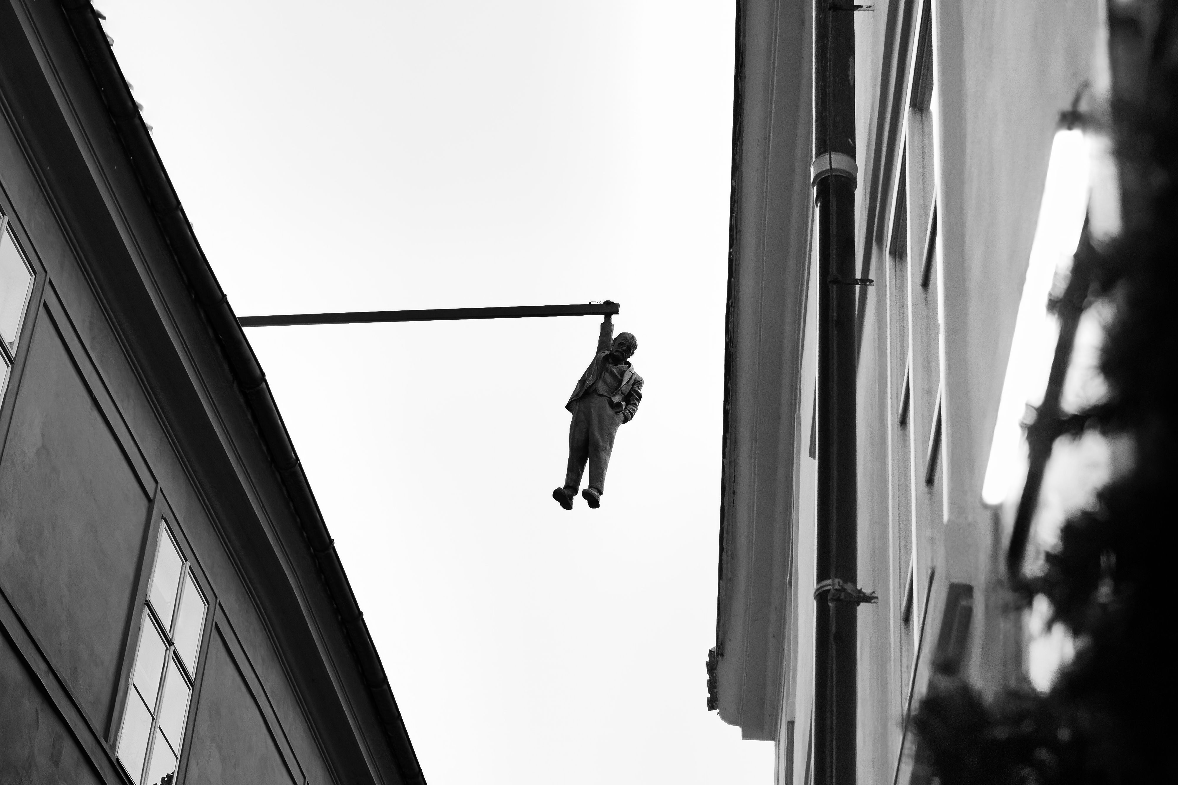
The hanging man needs confirmation, usually a close below its real body. Without that, Nison says, the bull trend remains entrenched. I like this because it is a good reminder that a pattern is a hypothesis, not a fact.
Why Candlesticks Are Not Enough
Nison is direct about the limits. Candles are excellent at early reversal signals, but they give no price targets. He also says that where a pattern appears matters more than the pattern itself. A bullish engulfing pattern at a resistance area is a poor place to buy, because the upside is capped.
That is where convergence comes in. His term for it is a group of signals, candle or Western, pointing at the same area. The more signals that agree, the more weight that area carries. Here are three Western indicators and how they pair with candles.
Three Western Indicators and Their Psychology
Bollinger Bands
Bollinger Bands draw a 20-period moving average with an upper and lower band set two standard deviations away. The bands widen when volatility rises and narrow when it falls. A narrow band is called a squeeze, and it often comes before a large move.
The psychology is calm before a decision. Traders go quiet, ranges shrink, and then something forces everyone to pick a side. A candle breaking out of a squeeze tells you the direction.
ADX
The ADX was developed by J. Welles Wilder and measures trend strength on a scale of 0 to 100. It says nothing about direction. A reading above 25 is the common threshold for a strong trend, although some traders prefer 20.
In human terms, ADX measures how much the crowd agrees. A low reading means buyers and sellers are trading blows. A high reading means one side has taken control and the other has given up. This is useful before trusting a candle signal, since reversal patterns mean less in a market with no trend to reverse. Nison makes the same point about doji in a trading range.
RSI
RSI compares the size of recent gains with recent losses, using closing prices only. Its two main uses are spotting overbought and oversold conditions, and spotting divergence. Nison gives an example where a dark-cloud cover formed at new highs while the RSI was overbought and lower than at the previous peak. Price made a higher high, but momentum did not. That is a crowd paying more for less conviction.
His phrase for oscillators is a storm cloud. They warn you, and the candle gives the final confirmation.
Honourable Mention: Fibonacci Retracements
The Fibonacci sequence runs 0, 1, 1, 2, 3, 5, 8, 13, and the ratio between neighbouring numbers settles near 0.618. That ratio appears in natural systems such as nautilus shells and the arrangement of leaves on a plant. Traders mark the 61.8% level, plus the 50% level that Nison calls the most widely watched, as places where a pullback may stop.

I am sceptical about the nature argument. One source I read put it well: the golden ratio in nature is a law, while the 61.8% level on a chart is a social consensus. It works to the extent that enough people watch it. That is psychology again, and Nison's advice fits: do not trade a retracement level unless a candle pattern confirms it.
What I Took From It
Reading the book changed how I look at a price chart. I now see a negotiation between two groups, with every candle recording who was winning and by how much. That is the reason I think these charts are worth studying for anyone interested in visualisation. Very few charts encode this much behaviour in so little space.
I am not trading on the back of this yet. My next step is to take one asset I already hold, pull up its daily chart, and mark every hammer, doji and Bollinger squeeze from the last six months. Then I will check which ones the RSI and ADX agreed with.
Next Steps
The plan is to automate what I have described in this article. Before I write any code, I want to spend more time reading charts by hand on the stocks I already follow. I need to know which patterns I actually trust, and Nison says the same: all candle signals may work in your markets, or only some of them, and you learn which with experience.
Once that is done, the tool will have three parts.
- Data. A script pulls daily price data (open, high, low, close and volume) from a stock market data provider API. I have not picked a provider yet; free-tier limits and history depth will decide.
- Signals. The script calculates the indicators (Bollinger Bands, ADX and RSI) and detects candle patterns such as the hammer, hanging man and doji. A signal fires only when a candle pattern and an indicator agree, which is the convergence idea from earlier. A hammer after a decline, with RSI oversold, counts. A hammer on its own does not.
- Alerts. Each signal sends me a notification, so I do not have to check charts every day.
The hanging man needs a close below its real body before it counts, so the code has to wait for that confirmation. The ADX filter should also stop it flagging reversals in markets with no trend to reverse.
Last-Six-Months Simulation
As a proof of concept, I will also build a simulation over the last six months. It will replay the data day by day and take a trade every time a signal fires. Then I will check the results: would these signals have made money? If the answer is no, I would rather find out on historical data than with real money.
The simulation will have limits. Six months is a short window, and a result from one market phase says little about another. I will report the number of trades alongside the profit, and note which signals did the work.
I will publish the tool and the simulation results here when they are ready. If you want to know when that happens, stay tuned and subscribe to get notified.