TL;DR
The mean (average) is the most commonly used measure of central tendency, but it only works well when data follows a normal, bell-shaped distribution. In most real-world cases, the median is a more reliable and robust indicator of what is "typical." This article walks through five data distributions using daily website click data to show exactly when and why the mean misleads, and what to use instead.
Who Should Read This?
BI professionals, digital marketers, web analysts, product managers, users of analytics tools such as Google Analytics, Mixpanel, or Looker to make decisions and anyone who have ever looked at an "average" and assumed it tells the full story.

"Average Always Means Typical"
Ask anyone to summarise a dataset and the first thing they will do is calculate the average. It is intuitive, quick, and universally understood. Most analytics dashboards default to the mean, and most people accept it without question.
The problem is that the mean does not always represent what is typical. For a lot of the data we work with every day, it can be actively misleading. And when decisions are based on a misleading number, the consequences add up.
This is one of the central ideas in a book on measurement and data sense making I have read: Data Loom by Stephen Few. Stephen describes the misuse of the mean as "perhaps foremost among the measurement problems" they have encountered in professional practice. That is a strong claim, but once you see it with real data, it is hard to disagree. The book argues that the mean was specifically designed as a measure of central tendency for normal distributions, and that using it outside that context is a measurement error, not just a preference.
The excerpt also introduces a second, related failure; relying solely on any single measure of central tendency, even the right one, without also considering the spread and shape of the data. Both failures are demonstrated below with five datasets.
What the Mean Actually Requires
Before using the mean, there is a precondition: your data should follow a normal distribution. A normal distribution is symmetric and bell-shaped, with most values clustering in the middle and frequency tapering off gradually on both sides.
When that shape holds, the mean and the median land very close to each other and both describe "typical" accurately. But when the shape changes, the mean drifts away from typical, sometimes dramatically. The median, which simply marks the middle value in a sorted dataset, is far more resistant to that drift. It does not get pulled around by extreme values.
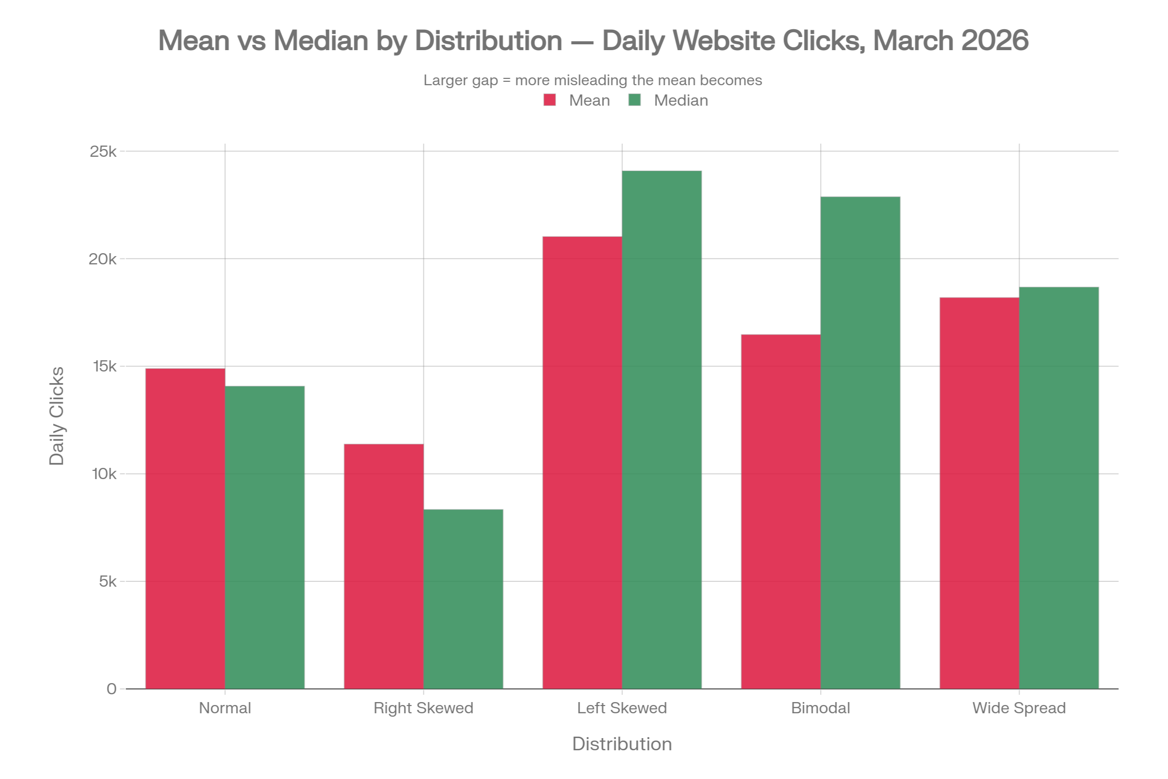
Five Datasets, Five Stories
To make this concrete, the following five datasets show daily website clicks for a hypothetical site during March 2026. All five share the same range (2,000 to 30,000 clicks per day), but they have very different distributions. The same business could sit behind any one of these five tables, and yet each one tells a completely different story.
| Distribution | Mean | Median | Min | Max | P25 | P75 | Std Dev | Mean - Median |
|---|---|---|---|---|---|---|---|---|
| Normal | 14,894 | 14,072 | 10,641 | 21,519 | 13,028 | 16,732 | 2,898 | +822 |
| Right Skewed | 11,378 | 8,343 | 5,004 | 30,000 | 6,626 | 11,208 | 7,780 | +3,035 |
| Left Skewed | 21,029 | 24,082 | 2,069 | 29,491 | 21,594 | 26,192 | 8,391 | -3,053 |
| Bimodal | 16,471 | 22,877 | 4,700 | 27,853 | 6,776 | 24,646 | 9,159 | -6,406 |
| Wide Spread | 18,192 | 18,677 | 4,092 | 30,000 | 13,913 | 22,204 | 6,993 | -485 |
1. Normal Distribution: When Mean Is Appropriate
In this dataset, traffic is steady and consistent throughout March. Most days see somewhere between 13,000 and 17,000 clicks. The mean is 14,894 and the median is 14,072; a gap of just 822 clicks. Both numbers tell roughly the same story.
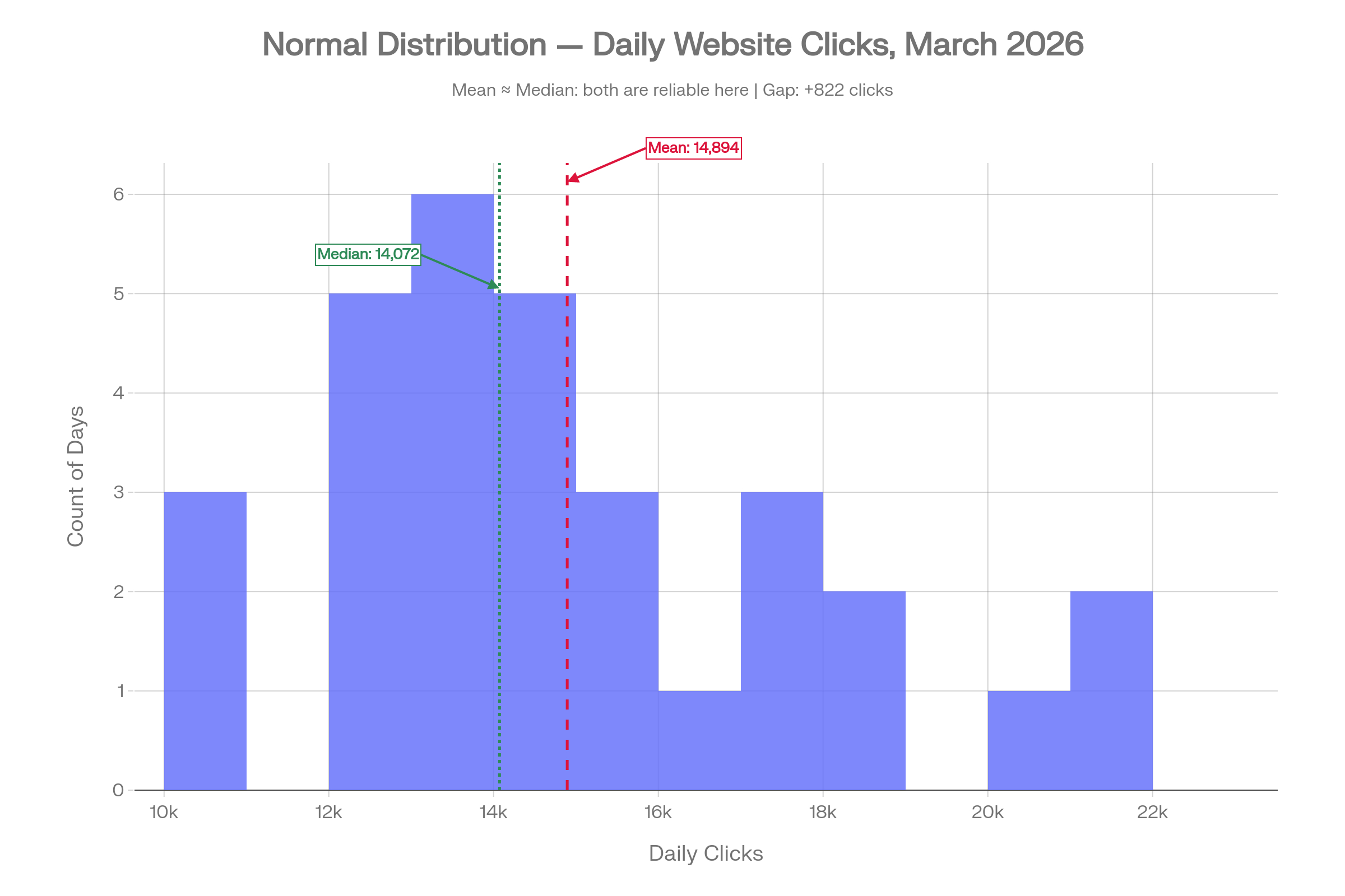
This is the scenario where the mean earns its place. The data is symmetric, there are no days dramatically distorting the picture, and reporting an average of around 15,000 clicks per day is a fair and accurate reflection of what happened. Use this as your reference point for what well-behaved data looks like.
2. Right Skewed: When Viral Days Inflate the Mean
Now imagine a few pieces of content went viral, or a paid campaign drove extraordinary traffic on four or five days in March. Most days, the site attracted modest traffic in the 5,000 to 10,000 range, but those exceptional days pushed the click count toward 25,000 to 30,000.
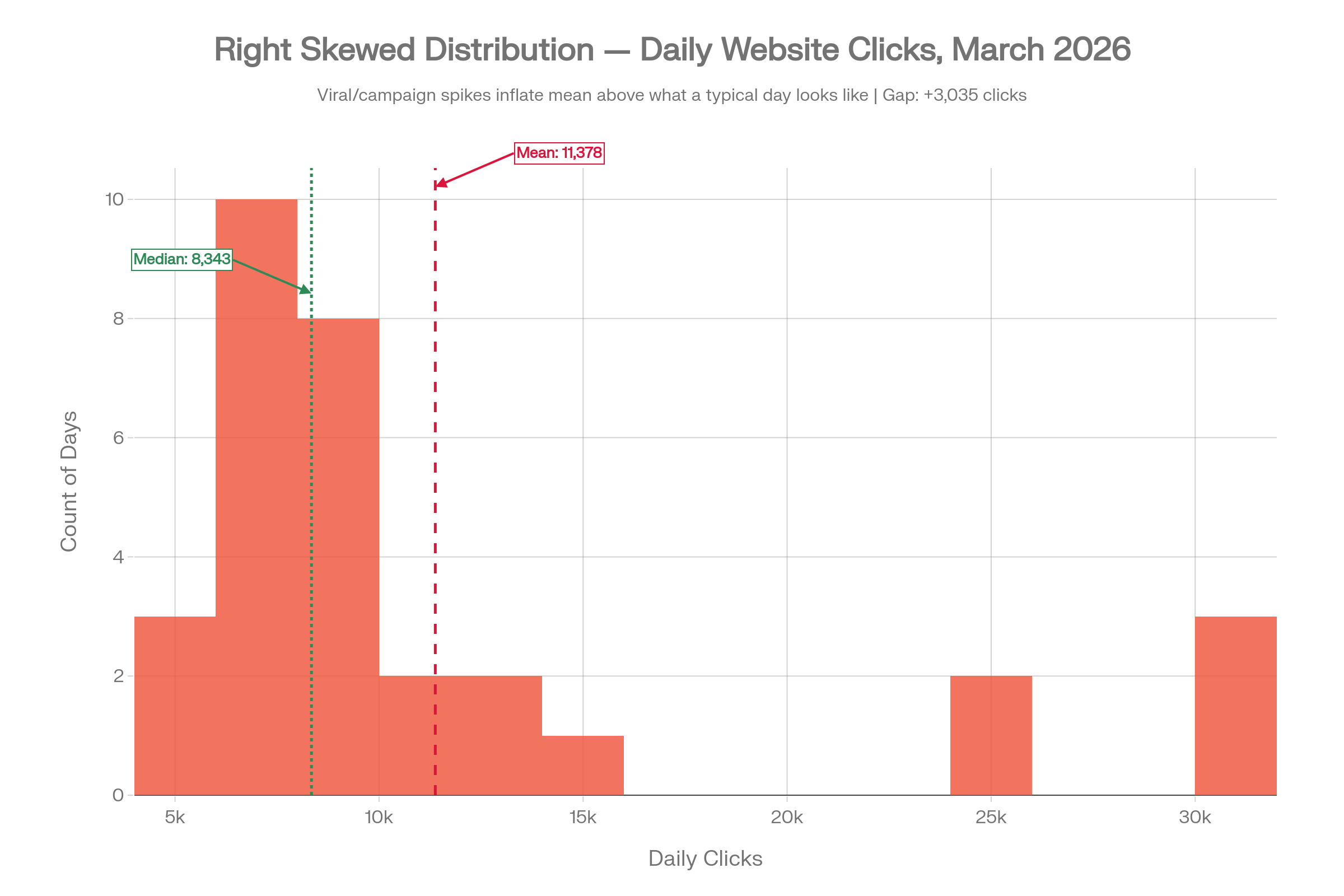
The mean comes out at 11,378 clicks. The median is 8,343. The gap is over 3,000 clicks. If you reported the mean as your "typical" daily traffic, you would be significantly overstating what a normal day looks like. A stakeholder seeing that mean might set targets, allocate budget, or plan content production against a benchmark that is only achievable on your very best days.
The mean has been pulled upward by a small number of outlier days. Those days were real, but they were not representative. This is the same dynamic the book illustrates with US household income, where a small number of very high earners inflate the mean well above what most households actually earn.
3. Left Skewed: When Outages Drag the Mean Down
Flip the scenario. The site is generally performing well, with most days in the 21,000 to 26,000 click range. But a few days in March experienced technical issues, or perhaps a search algorithm update caused a sudden traffic drop, pulling those daily totals down to 2,000 to 5,000.
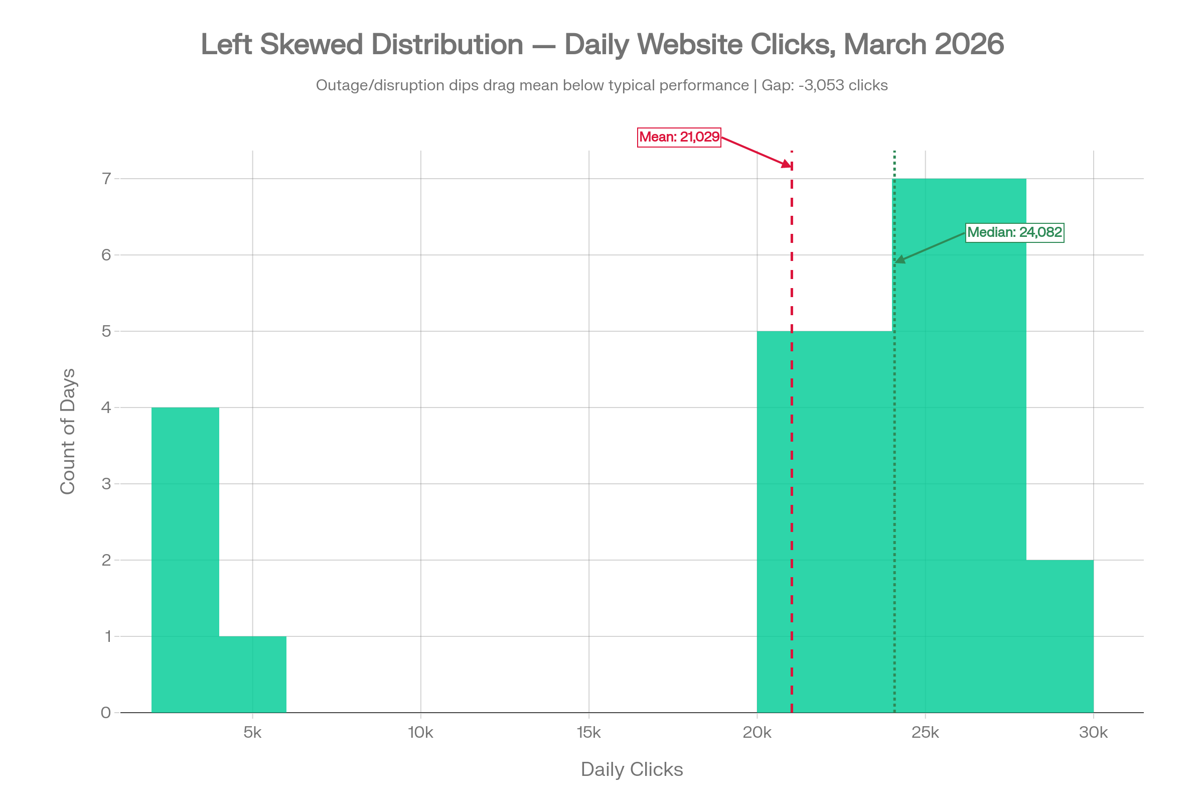
The mean is 21,029. The median is 24,082. The mean is nearly 3,000 clicks below what a typical day actually looked like. If you judged performance using the mean, you would be understating the site's usual capability. A few genuinely bad days are making the overall picture look worse than it is, and any decisions made on the basis of that number would be anchored to an untypically low figure.
4. Bimodal: When the Mean Describes a Day That Never Existed
This is the most striking example of the five. The site has two very distinct types of days: low-traffic days around 6,000 clicks (perhaps weekday mornings with a B2B readership), and high-traffic days around 23,000 clicks (weekend visitors or retargeting campaign windows). There is very little in between.
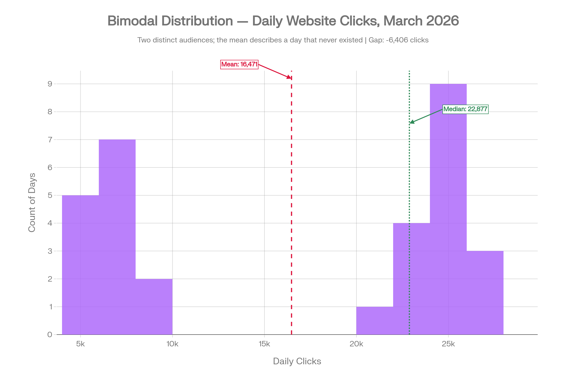
The mean is 16,471. The median is 22,877. The gap is over 6,400 clicks. More critically, neither number describes a day that actually happened in March. The mean of 16,471 falls squarely in the empty valley between the two peaks. Not a single day in the dataset had roughly 16,500 clicks.
If you are making decisions based on this number, you are reasoning about a version of your traffic that does not exist in the real data. The distribution here is the story; no single summary statistic can capture it. This is the case the book makes most powerfully: the shape of the data carries information that the mean simply cannot communicate.
5. Wide Spread: When Central Tendency Alone Is Not Enough
Here, the mean and the median are almost identical: 18,192 and 18,677 respectively, a gap of under 500 clicks. On the surface, this looks like the most straightforward dataset of the five.
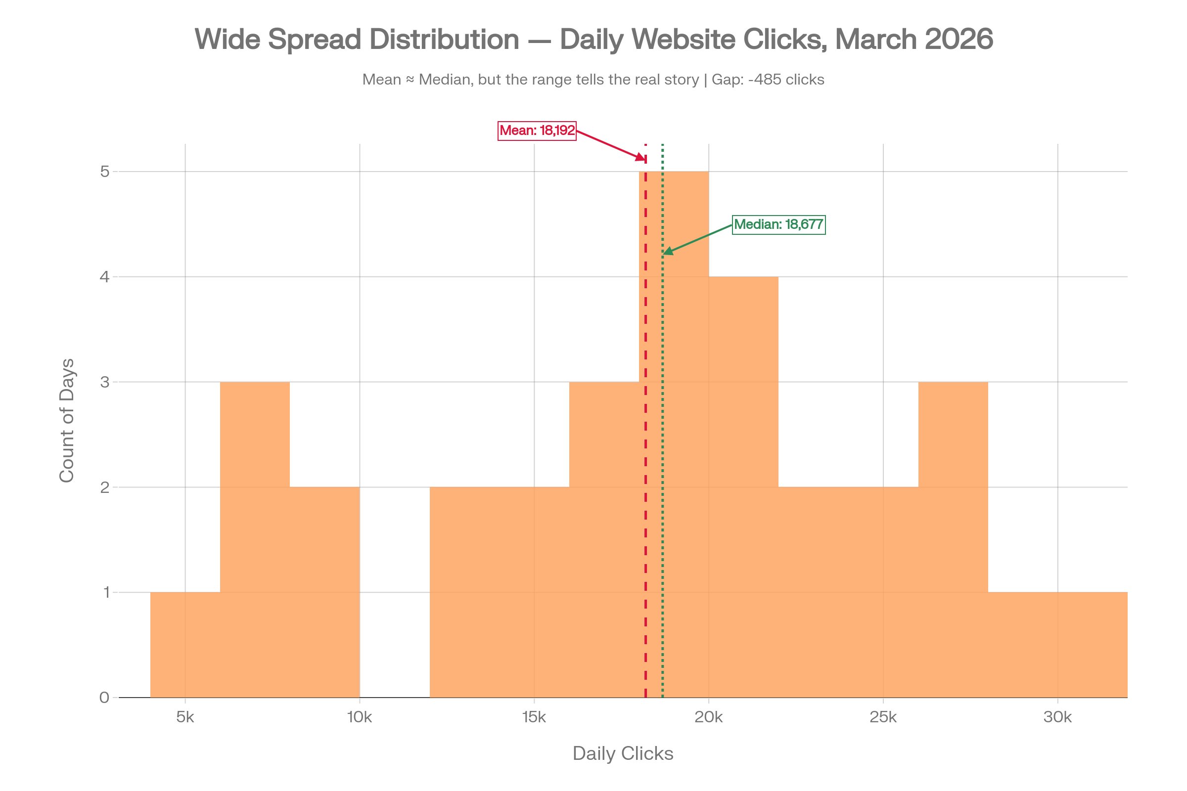
But the range is 4,092 to 30,000 clicks. The standard deviation is nearly 7,000. The 25th percentile is 13,913 and the 75th percentile is 22,204, an interquartile range of over 8,000 clicks.
If you reported only the median, you would have no idea how volatile this traffic actually is. Some days the site barely gets 4,000 visits; other days it gets 30,000. Planning based solely on the midpoint would leave you blindsided on low-traffic days and under-exploiting the high ones. This is the second failure mode described in the book excerpt: even when the median is the right tool, it does not tell the full story on its own.
What to Use Instead
The solution is not complicated, but it does require a small shift in habit.
For central tendency, default to the median rather than the mean. Particularly if your data contains outliers, spikes, or is not symmetric, the median is the more robust choice.
For a fuller picture, pair the median with the following:
- Minimum and maximum: the full range of what happened
- 25th and 75th percentile: what a typical low day and a typical high day look like, without the distortion of extremes
- A histogram: so you can see the shape of the distribution directly, rather than inferring it from a single number
Most analytics tools, whether you use Google Analytics 4, Mixpanel, Looker, or PowerBI, can surface these numbers with minimal extra effort. A quick distribution view will immediately reveal whether your data is skewed, bimodal, or highly variable, and from there you can decide which summary statistics actually make sense to report.
Treat Mean as the Exception, Not the Default
Mean is a useful tool in the right conditions, but those conditions are narrower than most people assume. When the data is skewed, bimodal, or widely spread, the mean produces a number that can mislead without warning.
Median is more robust. It is resistant to outliers, it does not require symmetry, and as a default starting point for "what is typical," it is almost always a better choice than the mean. It is not perfect either, and it does not replace the need to understand the shape and spread of your data; but it is a far safer first move.
The next time you open your analytics dashboard and see an average, ask yourself: is this data actually normally distributed? If you do not know the answer, it is worth spending five minutes looking at a histogram before acting on that number. That single habit change can meaningfully improve the quality of the decisions you and your team make every week.

.jpg&w=3840&q=75)